
Agency creative. What the client approved stays approved.
Adapt a master for every placement, set a client’s own photographs in its brand style, write in one language and deliver in two, and take each round of notes without disturbing the work that is already signed off.

Creative work, in context
Every client gets the same standard of finish.
An agency carries several brands at once, each with its own guidelines, approvers and media plan. These examples follow three fictional clients through different parts of production: a city’s heat-safety campaign and a late change to it, a farmers’ market network’s photo library and a ski resort’s season launch.
Adaptation at volume
Turn one approved master into every placement.
A city’s heat-safety poster becomes twelve placements, from a 1080×1920 Story to a 320×50 mobile banner. Every line that appears is the approved wording, letter for letter, and the master, the Story, the portrait and square feed sizes and the landscape size keep every line. The laughing boy from the photograph appears in every format.
Explore the complete studyExplore the versions
Master · 2:3 poster
Ideogram 4.5 built the approved master from one photograph.
Client brand guidelines
Set a client’s own photographs in its brand style.
Six photographs from a farmers’ market network’s library become ads in six formats, each laid out in the client’s field green, tomato red and cream with a serif headline and a cream tab that holds the logo. The people, the produce and the settings carry over from the client’s photographs. Switch photographs here, or open the study for all six formats and the Spanish versions.
Explore the complete studyExplore the versions
Grower · Social 1:1
Ideogram 4.5 set the grower’s portrait into a 2048×2048 square with the headline over a soft green gradient.
Localization
Write the campaign in French first, then adapt it to English.
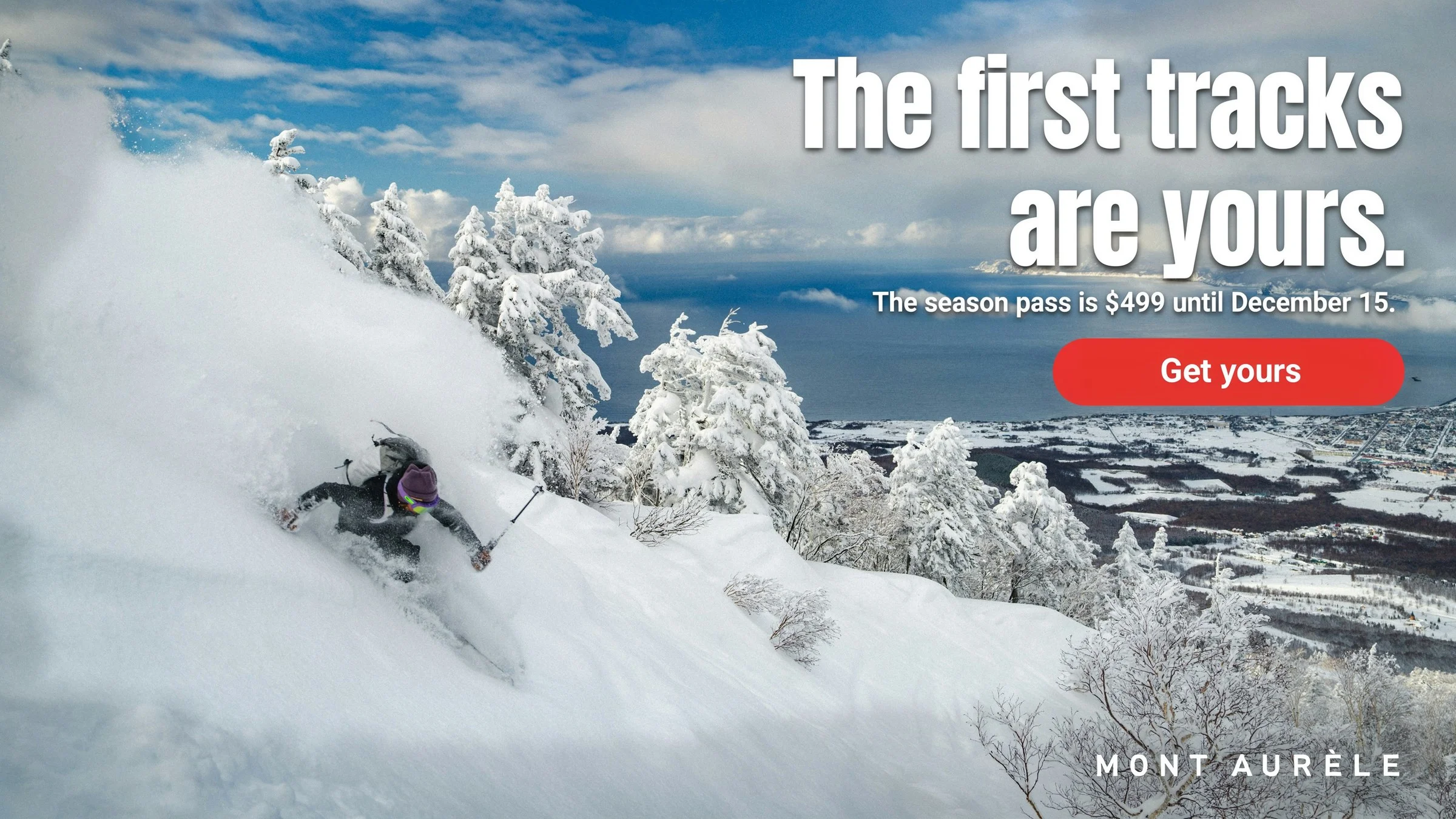
A Quebec ski resort’s season launch is written in Quebec French, and every accent, apostrophe and price is rendered in the image. The English version is a precise edit of the French master. The skier, the snow, the trees and the resort name keep the French master’s pixels, and only the type and its soft shadow change, as the edit-area map shows.
Explore the complete study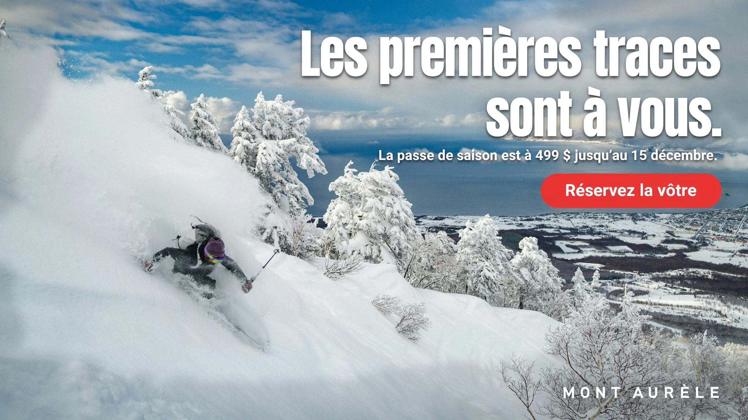
Edit-area map
Drag the divider or use the arrow keys to compare.
Pitch and presentation
Show the client the work where it will run.
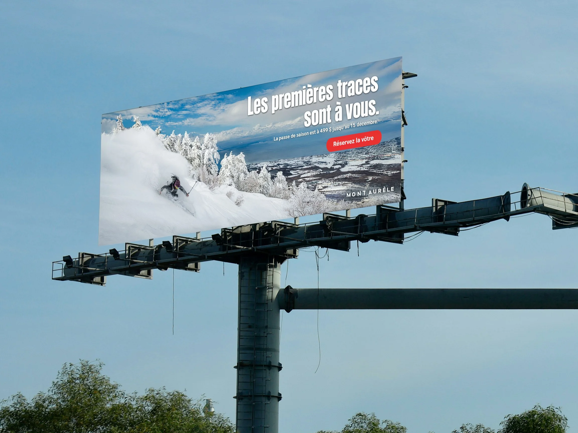
Before the media buy, Ad Resizer rebuilds the French launch at 3:1, and a masked precise edit places it on a photograph of an empty billboard, in the face’s perspective and daylight. The edit-area map shows the change on the billboard face, with faint tone shifts in a thin band along its lower and right edges. The pole, the trees and the rest of the sky are the photograph’s pixels.
Explore the complete study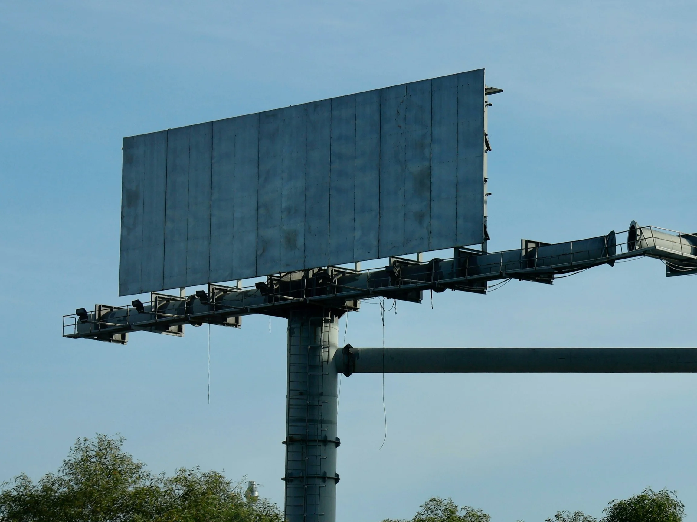
Edit-area map
Drag the divider or use the arrow keys to compare.
Revisions and approvals
Take a late note without rebuilding the set.
After the placements were approved, the city extended its cooling-center hours. A precise edit changed that one line to 9 a.m. to 10 p.m. in five sizes, from the master to the landscape placement. Compare the approved and revised master here. The boy, the layout and every other line read as they did, and the edit-area map marks only the hours line. The study shows the same edit in all five sizes.
Explore the complete study

Edit-area map
Drag the divider or use the arrow keys to compare.
Take a closer look
Open the complete studies.
Each one holds the full references, comparisons and interactive examples.

Placements and revisions
Inspect the heat-safety master beside its twelve placements, then take a late note through five approved sizes and open each edit-area map.

Brands and languages
Explore six client photographs in six formats, in English and Spanish, then compare a French-first season launch, its English version and its billboard.
Built around your team
Your creative standard.
A workflow to match.
Every step builds on your imagery, your references and the work your team needs to deliver.
- 01
Bring the approved work
Start with the master, the client’s photographs, the copy deck and the guidelines that decide what may change.
- 02
Adapt, localize and revise
Rebuild each placement, set every language from the copy deck and make each round of notes as a precise edit.
- 03
Check before it ships
Read every line against the copy deck, inspect the edit-area maps and confirm current platform specifications before trafficking.
Frequently asked questions
How does the copy stay word for word in every placement?
Every prompt quotes each line of the approved copy, and a copy rule decides which lines each size carries. In these examples, the master, the Story, the portrait and square feed sizes and the landscape size keep every line, and the three smallest banners keep the headline and a short 311 line. Every output was read against the copy deck, and any take with a wrong letter was made again or corrected with a precise edit.
Which placements can Ad Resizer make?
Ad Resizer takes a finished ad and returns it at an exact size, including standard web display sizes, square and portrait feed sizes, 1080×1920 Stories and wide landscape sizes. In these examples, Ad Resizer rebuilt the Story, the portrait and square feed sizes, the landscape size, the 728×90 and 320×50 banners and the 3:1 ski launch at their exact sizes. Ideogram 4.5 laid out the other display banners at two to four times their delivery size, so the type stays sharp on high-density screens.
Can the work follow each client’s brand guidelines?
Yes. The prompts in these examples carry the client’s colors, type styles, layout devices and the tab kept clear for the logo, and the logo file was placed after each layout was made, the way a studio places it.
Are client files used to train Ideogram’s models?
No. Enterprise inputs are not used to train Ideogram’s shared models, and training a custom model on a client’s material is opt-in. Data retention can be set as low as 30 minutes, and Ideogram is SOC 2 audited. The Ideogram Trust Center has the full details.
What does working directly with Ideogram include?
Agencies that work with Ideogram directly can have a custom model trained for each client, so its output follows that client’s visual identity by default. Ideogram’s research and engineering team also scopes and builds custom workflows for the production you repeat every week, such as format adaptation, localization and retouching.
How were these examples made?
Every ad on this page starts from a photograph on Unsplash, used under its free license. Every layout, translation, edit and placement was made with the Ideogram API: Ideogram 4.5 generation and precise edit, and Ad Resizer. The Long Furrow logo was generated with Ideogram and placed after each layout was made, and the edit-area maps were computed from pixel differences between each pair of images. The City of Port Ellery, Long Furrow Markets and Mont Aurèle are fictional, and the people in the photographs are not affiliated with them and do not endorse them or Ideogram.
More in Media, Services & Platforms
Explore related industries.
Let's shape what comes next
Take the next brief from pitch to placement.
Talk with our team about custom models for each client and the production your studio repeats every week.