
Brands and languages
Explore six client photographs in six formats, in English and Spanish, then compare a French-first season launch, its English version and its billboard.

Client brand guidelines
Six photographs become six formats in two languages.
Each photograph from the market network’s library is set in the client’s style: field green, tomato red and cream, a serif headline under a thin red rule, and a cream tab that holds the logo. Ideogram 4.5 built all six layouts from their photographs. The Spanish versions are precise edits of the English ads, so only the type changes.
Client logo file
Long Furrow logo · PNG
Explore the versions
Social · 1:1
Ideogram 4.5 set the grower’s portrait into a 2048×2048 square with the headline over a soft green gradient.
Inspect edit-area maps
Lavender marks the pixels that changed between each English ad and its Spanish version. The changes stay on the type.
Edit-area map · Social · 1:1
Edit-area map · Story · 9:16
Edit-area map · Web banner · 16:9
Edit-area map · Email header · 3:1
Edit-area map · Landscape post · 1.9:1
Edit-area map · Print page · portrait
- The logo was generated with Ideogram and placed in each cream tab after the layout was made.
- The Spanish lines are sample copy. Have a native-speaking copy editor review them before release.
Localization
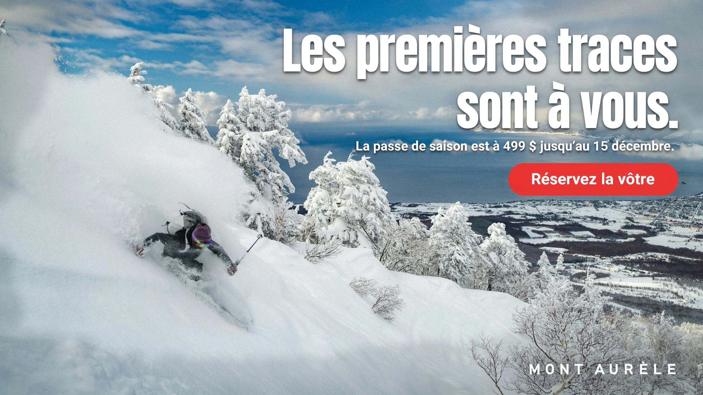
The campaign is written in French first and adapted to English.
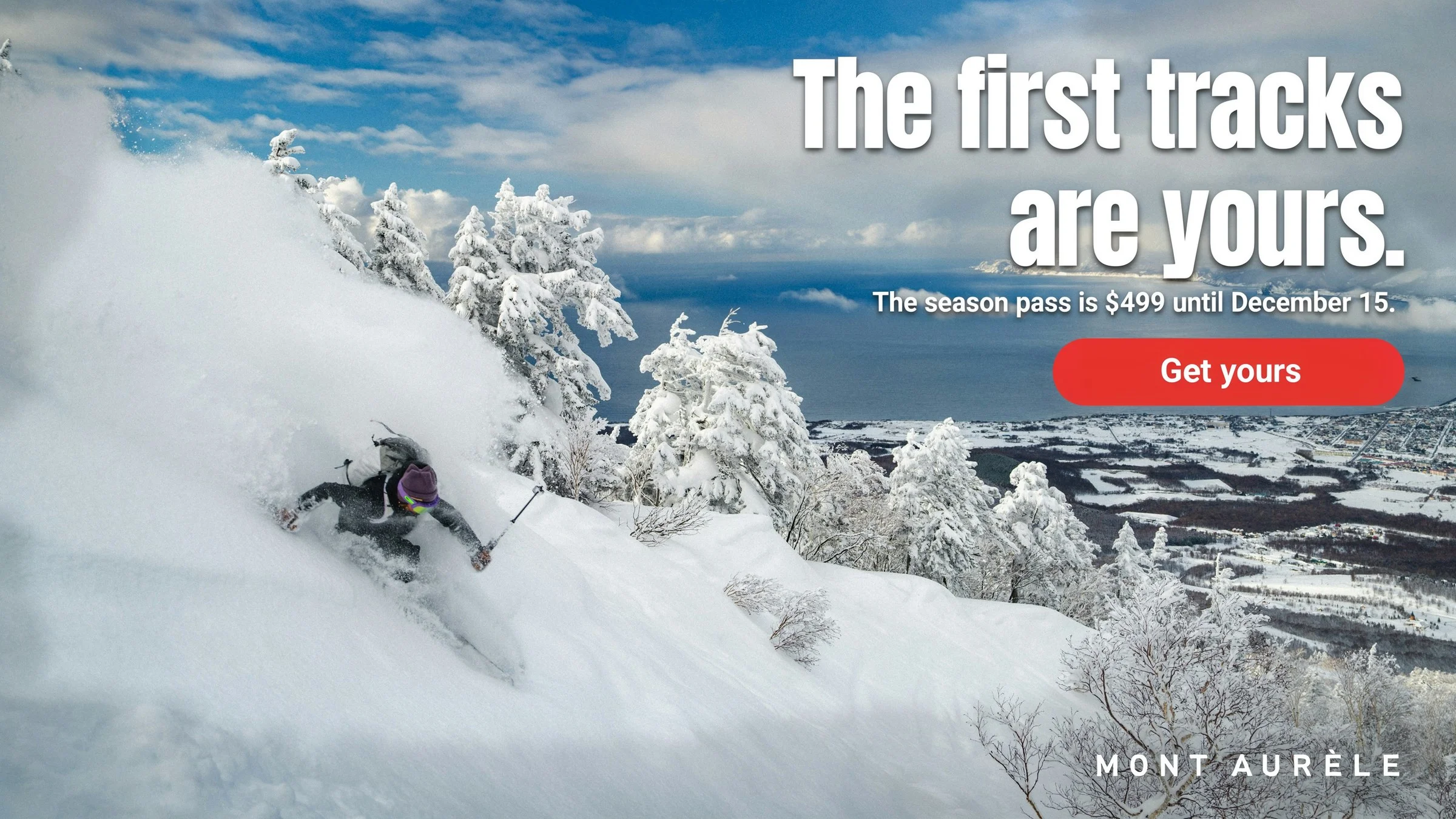
The season launch was written in Quebec French: the accents, the typographic apostrophe in “jusqu’au”, the price written as 499 $ and the accented capital in MONT AURÈLE are all rendered in the image. The English version is a precise edit that sets new words in the same type, size and position.
Starting photograph
Unsplash photograph
Edit-area map
Drag the divider or use the arrow keys to compare.
- The French is sample copy written for this example. Have a Quebec copy editor review any campaign before release.
Pitch and presentation
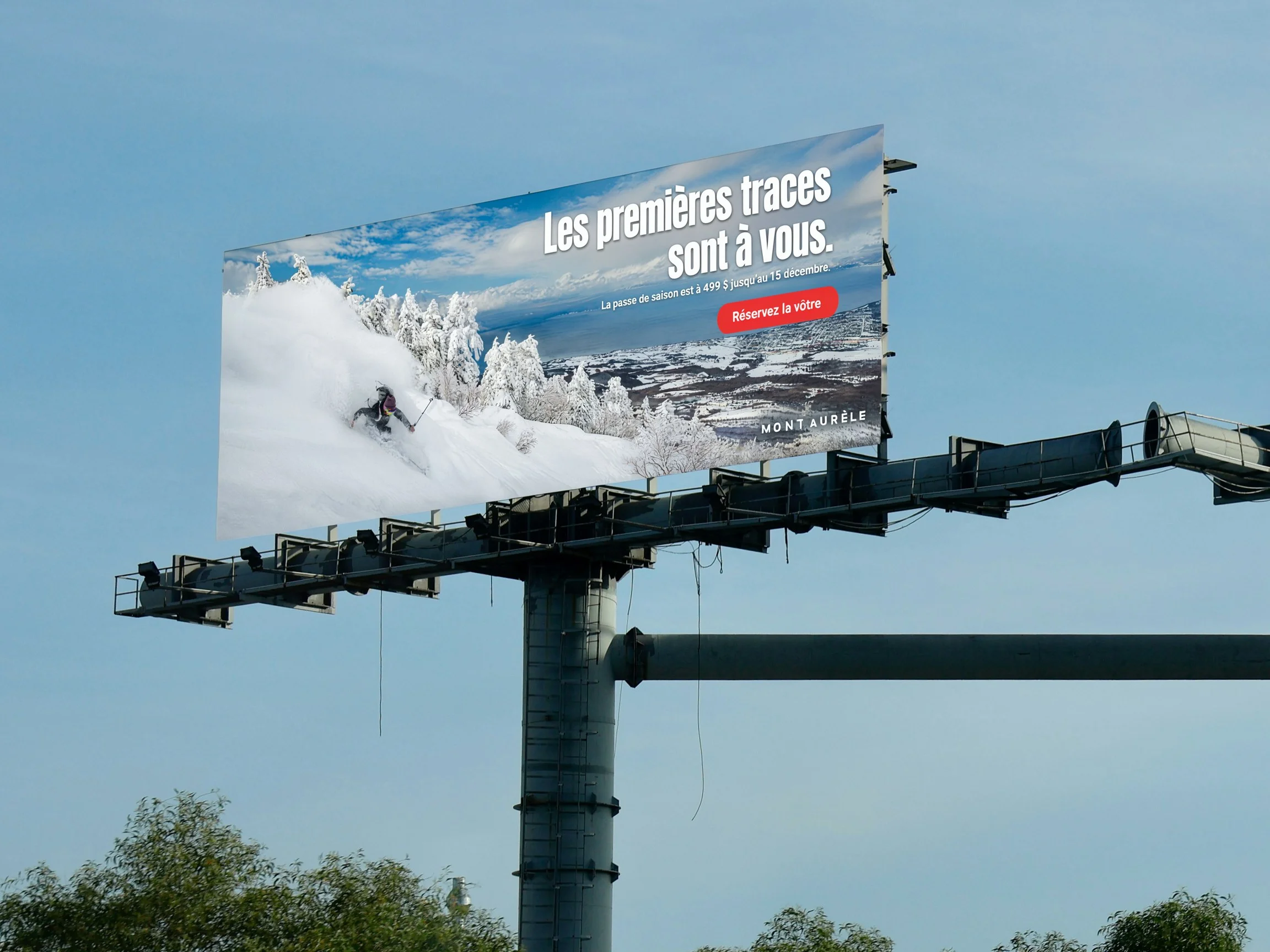
The French launch goes up on a billboard.
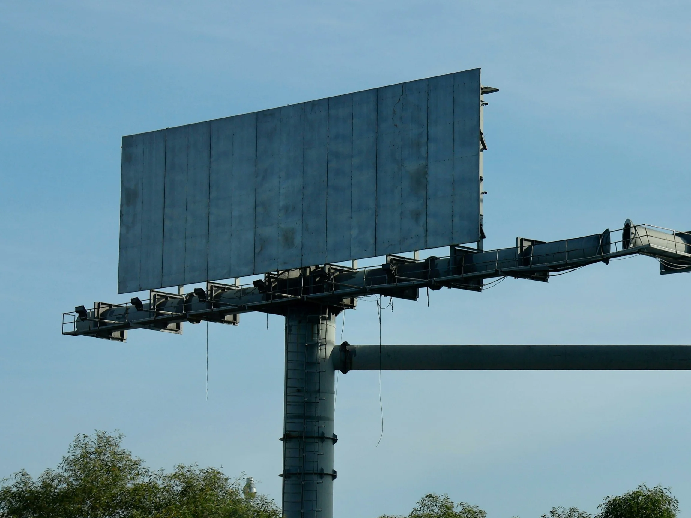
Ad Resizer rebuilt the French master at 3:1, and a masked precise edit placed it on an empty billboard. The edit-area map shows the change on the billboard face, with faint tone shifts in a thin band along its lower and right edges. The pole, the trees and the rest of the sky stay as photographed.
Reference image
Adapted placement · 3:1
Edit-area map
Drag the divider or use the arrow keys to compare.
- Ad Resizer redrew the skier slightly when it rebuilt the 3:1 version, so the billboard carries that version rather than a pixel copy of the French master.
Keep exploring
Continue with another Advertising & Creative Agencies study.
It holds every reference, comparison and interactive example.

Let's shape what comes next
Take the next brief from pitch to placement.
Talk with our team about custom models for each client and the production your studio repeats every week.